SnapApp Fundamentals - Fields
on 06-23-2024 12:00 AM by SnapApp by BlueVector AI
966
A field represents a column within an object. They are attributes that describe the records. Common examples are name, address, date, and ID. Each field has a name, data type, and may have other additional properties.
After adding an object, you can create a field and configure its properties to define its role and functions.
Table of Contents
- Create a field
- Configure basic properties of a field
- 1. Define the label
- 2. To assign a description
- 3. Configure display properties of a field
- 4. Assign a placeholder
- 5. Enter an initial value
- 6. Help text
- 7. Define a formula
- 8. Set the show settings
- 9. Check validity on field entries
- 10. Set the field width
- 11. Enter the sequence
- 12. Configure the edit properties of a field
- 13. Set the validation properties
- 14. Make the field required
- View details of a field
- Edit a field
- Delete a field
Create a field
To create a field:
- Open Settings from the User menu.
- Select Fields from the Data menu.
- Click +Add New from the top header to create a field.
To create a field from an object:
- Open Settings from the User menu.
- Select Objects form the Data menu.
- Select object from the list.
- Click +Add New Field at the header of the Fields section
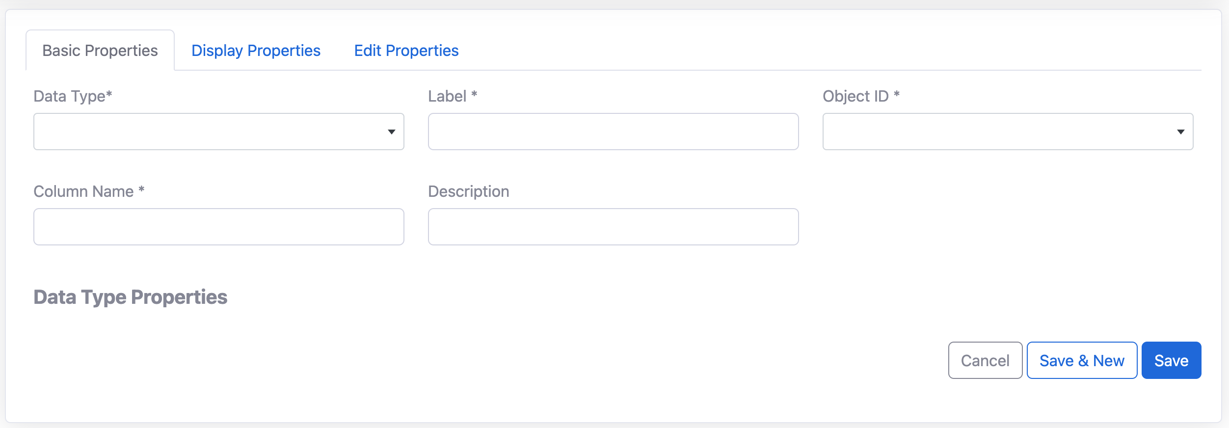
Configure basic properties of a field
The basic properties of a field describe the field and are the details of how the field is identified. These properties are configured upon creation of the field.
Assign the field a data type:
The field’s data type defines the function of the field in your app. Below is a list of data types you can use. To set the data type: 1. Tap on the Data Type dropdown 2. Select from the list.
| Type | Description |
|---|---|
| Address | The name used to store the object in the underlying database. This is not visible anywhere in the application and can not be changed once set. |
| Color | Used to store a hex code for a color |
| Data Type | Different types of supported data types. |
| Date | Stores date information without time. The Date format in SnapApp is YYYY-MM-DD. |
| DateTime | Stores date and time information in the format YYYY-MM-DD 00:00:00. |
| Decimal | It provides the greatest number of significant digits for a number. It supports up to 29 significant digits and can represent values in excess of 7.9228 x 10^28. It is particularly suitable for calculations, such as financial, that require a large number of digits but cannot tolerate rounding errors. Note : The number of decimal places cannot exceed the total number of digits. To fix the error, you need to ensure that the “Max Digits” is greater than or equal to the “Decimal Places”. For example, Max Digits: 5, Decimal Places: 2, this setup will allow for a maximum of 5 digits, with 2 of them being after the decimal point. |
| DocAI | Content Cell that supports document to get verified. |
| Drawing | Content Cell for any drawing purpose. |
| Duration | It is specified in days, hours, minutes, seconds, and milliseconds. All the values must be integers. You must change the string data type that arrives from different source fields to a single string value and then map this string value to the duration data type in the target. |
| Used to store the email addresses of users. The typical email format is required containing an ampersand. | |
| Enum | Allows users to select a value from a list of specified values. The typical application of this data type is a dropdown menu on a form. |
| EnumList | EnumList is the same functionality as an enum, but allows the user to select multiple values from the list. |
| EnumVisualList | This data type allows the user to select one or multiple images from a list of images. |
| File | Any file content that is saved on a computer or in a browser. This can be in the form of a PDF or document. The file is saved to the cloud or desired platform and made accessible through the app. |
| Icon | It is a small graphical representation of a program or file. When we double-click an icon, the associated file or program will be opened. For example, if we were to double-click on the My Computer icon, it would open Windows Explorer. |
| Image | Saved as URLs of the source. These images are accessible through the app and are .jpg, .png, and .gif types. |
| JSON | It is a text-based data format following JavaScript object syntax. Even though it closely resembles JavaScript object literal syntax, it can be used independently from JavaScript, and many programming environments feature the ability to read (parse) and generate JSON. |
| LatLong | This is set to id by default and can be changed once you add fields. The record label field is used to identify a record through out the application. This field will be treated as the primary field on list views and displayed when a record is referenced on other objects. For example, if you set the record label field to product number, the product number would display instead of a big id throughout the application. This makes your records more recognizable and easier to use. |
| LongText | A text field designed to hold large blocks of text. SnapApp stores characters in a long text field. This data type is useful for storing notes, comments, and long descriptions. |
| List | It is a collection type that can store ordered non-NULL elements of the same SQL data type. The LIST data type supports, but does not require, duplicate element values. The elements of a LIST data type have ordinal positions. |
| Number | A data type used for storing numeric information such as integers, floating-points, and doubles. |
| Percent | Percentages are displayed with the % symbol and are stored with either an integer or floating-point format. |
| Phone | The plural version of the label (e.g. Products). Plural labels are used when referencing a collection of records in an object or the object qas a whole. |
| Price | Used to represent the monetary value of an item, service, etc. These values are displayed with the currency symbol. |
| Progress Bar | It is a graphical control element used to visualize the progression of an extended operation, such as a download, file transfer, or installation. Sometimes, the graphic is accompanied by a textual representation of the progress in a percent or quantitative format. |
| Progress Harvey Ball | Harvey balls are round ideograms used for visual communication of qualitative information. They are commonly used in comparison tables to indicate the degree to which a particular item meets a particular criterion. This can be used to track the progress. |
| Rating | It is for assigning a ranking in a cell. |
| Ref | This is used to refer another file i.e object, workflow etc. |
| Show | These are columns that serve the sole purpose of improving the presentation of data capture forms and detail views by showing text, image, rich text, video etc that you want to show as static element. |
| Signature | It is an electronic process, symbol, or sound that gets associated or attached logically to a record of a contract. Based on the meaning from the law dictionary, it’s a way to sign a document electronically and agree without using papers. |
| Text | A text string |
| Time | Only the time is captured in the format 00:00:00. |
| URL | This is used to show any URL(link) type field. |
| Video | Content Cell |
| XY | This is used to denote the two Coordinates of the graph X and Y. |
| YesNo | A boolean data type that allows users to select from a binary menu. |
1. Define the label
This is the name of the field that is visible to the user Input a column name:
Each field has a name. This is the name used by the application to identify the field. In most cases this should match the column name in the underlying data structure.
2. To assign a description
Type the desired information into the description field. This is an optional value used to describe the field to system administrators. The description will be displayed only in the field details for system admins.
3. Configure display properties of a field
The display and edit properties determine the behavior of the field. Utilize these properties to customize your field. These properties can be configured upon creation of the field or edited later on.
4. Assign a placeholder
This is a value for the user that explains the expected format of the data entered, either a sample value or a description of what is expected.
5. Enter an initial value
The initial value is the default that is automatically set when a record is created. Users have the option to override the initial value unlike a formula. Type the desired text or numeric initial value into the Initial Value field, or open the Expression Builder from the field to enter an expression.
6. Help text
Help text assists in directing the application user. It is the information offered to describe the purpose of the field and is displayed on the screen when the user hovers over it.
7. Define a formula
The formula will auto-update the value of this field when the row is modified. Unlike the initial value, users cannot manually edit the value in this field. Type the formula directly in the field or open the Expression Builder to enter an expression. Check the Apply Formula To Existing Records box to immediately apply this formula to all existing records.
8. Set the show settings
Use show and show if to specify the audience and conditions under which the field should be displayed. By default, the Show option is enabled, meaning that the field will be visible to all viewers wherever it appears. Disabling this option hides the field throughout the application for all users. To hide the field, uncheck the “Show” checkbox. If you want the field to be visible to only certain users or in specific contexts enter a Yes/No expression into the Show If field.
9. Check validity on field entries
The “Valid If” is a condition expression the determines whether the user input for the field is acceptable. If the data does not meet the constraint, it may not be saved, or if filling out a form, the user may not be able to proceed. The “Invalid Error” field is the message that is displayed to the user when the Valid If constraint is not met.
10. Set the field width
11. Enter the sequence
12. Configure the edit properties of a field
13. Set the validation properties
Check the “Require” checkbox to require user input for this field. Required fields must be completed or selected by users. The field will be marked with an asterisk and will see an error message if they attempt to proceed without entering the necessary information. If filling out a form, the user will not be able to submit if the field is not filled out.
14. Make the field required
View details of a field
To view the details of a field:
- Open Settings from the User menu.
- Select Fields from the Data menu.
- Tap on the name of the field you want to view.
- Tap on the properties tabs to view the configurations.
Edit a field
To edit a field:
- Open Settings from the User menu.
- Select Fields from the Data menu.
- Find the field in the list you want to edit.
- Tap on
.png)
Delete a field
To delete a field:
- Open Settings from the User menu.
- Select Fields from the Data menu.
- Tap on the
Deleteon the field you want to delete.
.png)
Thank you for following these steps to configure your SnapApp components effectively If you have any questions or need further assistance, please don’t hesitate to reach out to our support team. We’re here to help you make the most out of your SnapApp experience.
For support, email us at snapapp@bluevector.ai